User testing on Fantom Finance

We successfully concluded the first round of user testing on the Release Candidate for Fantom Finance, the DeFi suite built on Fantom. Fantom Finance features three main components:
- fMint that allows users to lock FTM and mint the collateralized stablecoin fUSD
- fSwap, to swap fUSD with synthetic tokens
- fLend, to lend and borrow synthetic assets
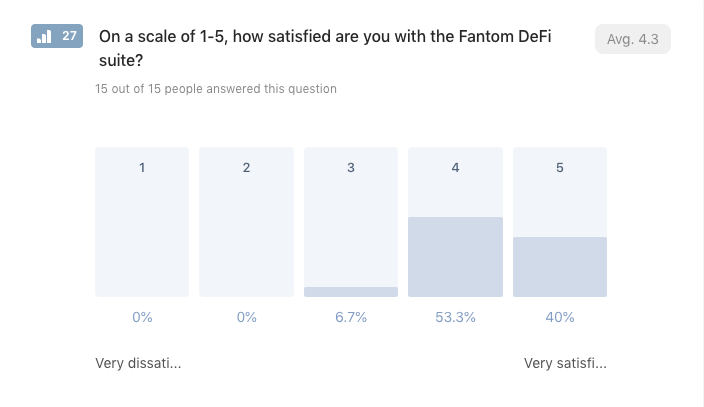
We selected 15 community members with different backgrounds and levels of expertise. Our main goal was to test the user experience and look for some yet unknown bug.We asked users to perform tasks across the whole suite, to make sure they’d try out every section. The overall impression was very positive: 93.3% of the testers were satisfied or very satisfied with the DeFi suite.
The research also revealed some valuable information about the habits and preferences of the users regarding DeFi platforms.
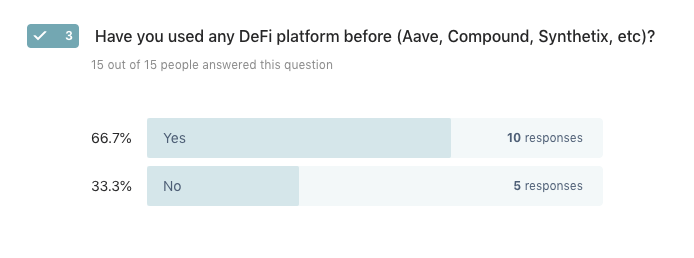
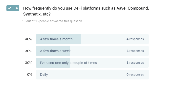
66.7% of the testers have used a DeFi platform before, and 70% of them are active users; they access a DeFi platform at least a few times a month.
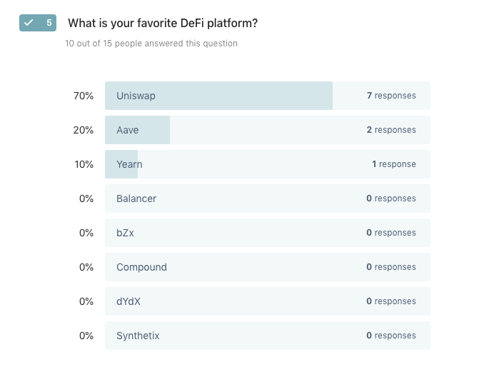
The majority of users favored Uniswap over other platforms. When asked to elaborate, almost unanimously, people liked the simplicity of use.
“It has a great and practical interface.”
“Good interface / metamask connection / clear rates explanations.”
“Real DEX, no tokens deposit anymore and really user friendly.”
The research showed that it was quite easy for users to mint fUSD and trade it on fSwap.
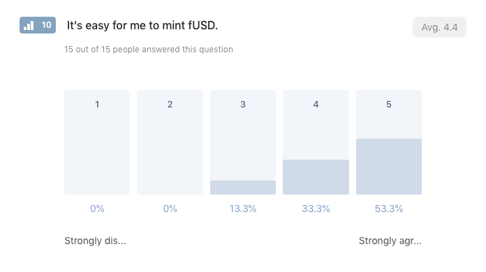
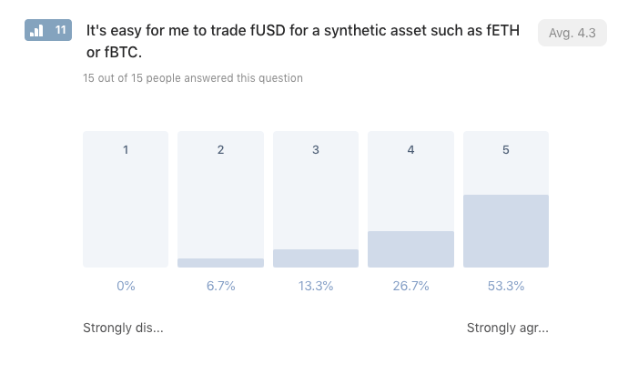
As expected, the borrow section of fLend showed slightly different results. The overall impression is still positive, but the data told us that the learning curve is steeper in this section and that we could improve the UX.
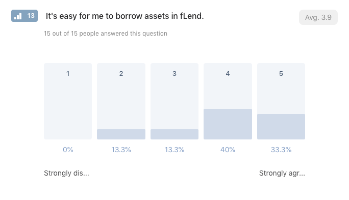
We received similar feedback for other sections of fLend.On the version they were testing, it seemed particularly difficult for users to understand their debt positions and pay them back.
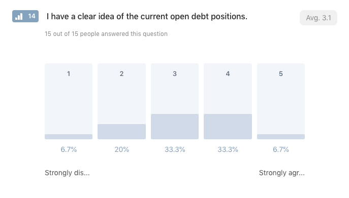
We felt this was a particularly important issue to address, and we fixed it already. We added a more precise overview of the open positions in the main DeFi section.
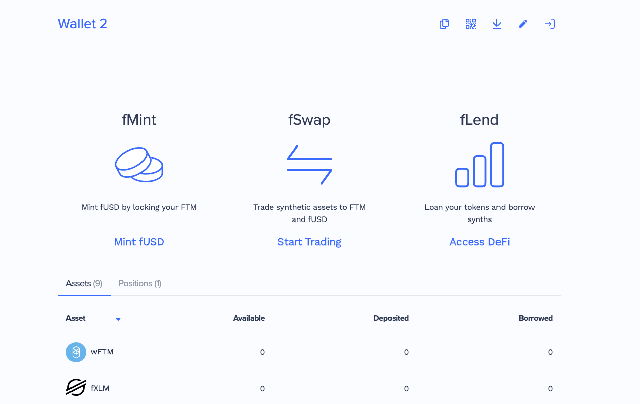
Users pointed out other pain points, all related to collateral management. It wasn’t too intuitive to adjust and collateral on fLend, and repay minted fUSD and unlock FTM.
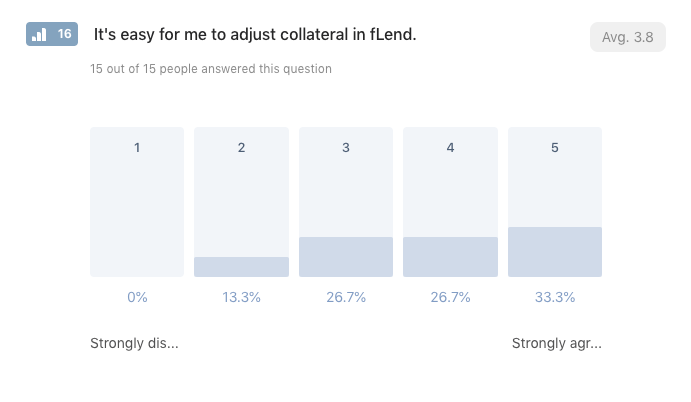
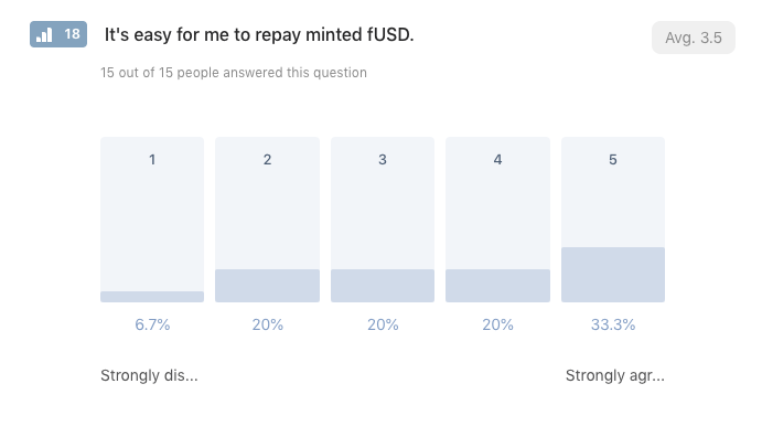
The confusion happened because we condensed those actions into a single slider. Using just one slider makes rebalancing quite fast, but it also makes it harder to understand and use properly.
Since Fantom Finance is a complex product, we decided to favor ease-of-use, which was also what our testers liked most about Uniswap.
We already made the changes, and now users have separate buttons to manage their collateral and debt positions. Lock FTM, unlock FTM, mint fUSD, repay fUSD, deposit to liquidity, withdraw from liquidity, borrow, repay, are all now separate, and clear to access.
This is the most critical improvement we made so far in terms of UX.
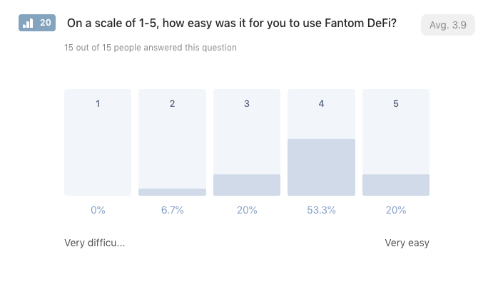
We wanted to make sure to shift the sentiment around the ease of use. While 73.3% of users found it easy or very easy to use, we aim to lower the barrier of entry and make it easier also for the 26.7% that didn’t find it particularly intuitive.
We’ll see how users will respond to the new changes to the interface in the next round of testing.
We also asked the users what they liked most about the DeFi suite. The majority loved the speed of use and having all the tools in one place within the wallet.
Finally, each of the testers gave us very extensive written feedback. They elaborated on how their experience was like, and what they found that could be improved.
To conclude, a big thank you to:
@JKC789
@solutionniste
@camgol
@blokcove
@xarnodo
@twixster10
@razorsmr
@TheRabbit0
@bu1137
@Acid | DH
@Cryptoi0
@JadennIsma
@bengonzo
@Cardicryptoking
@chuorin
Your feedback and continuous support are much appreciated!


